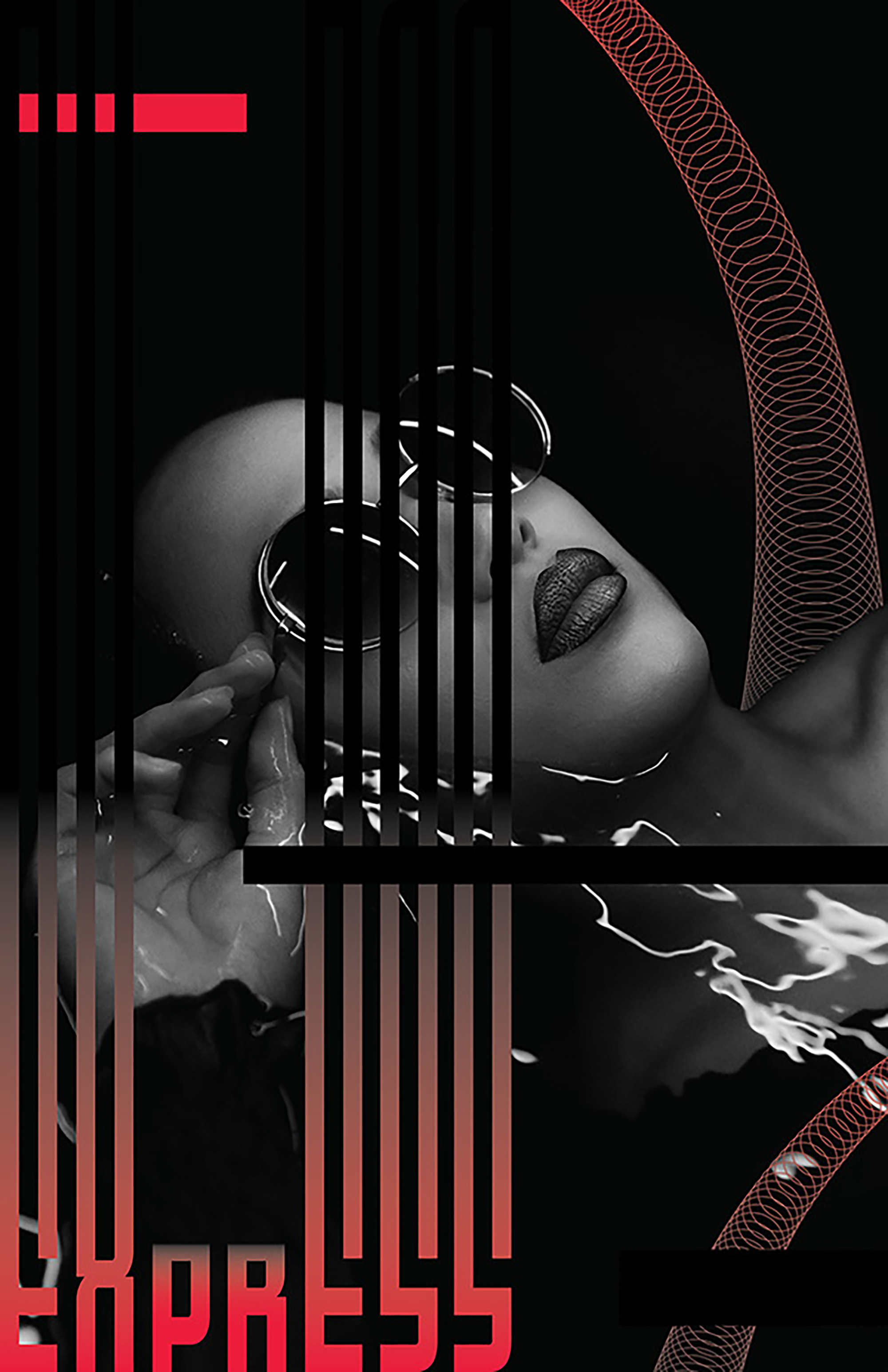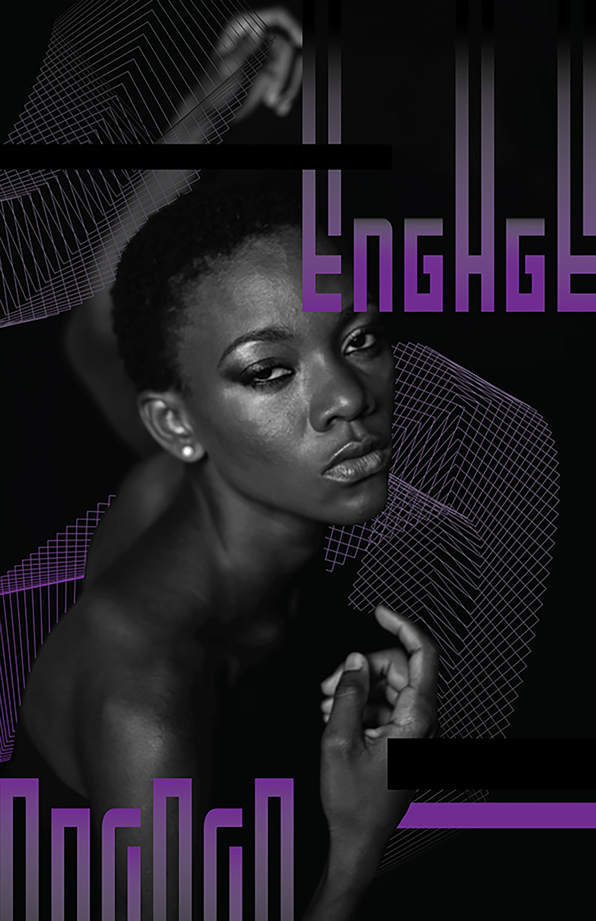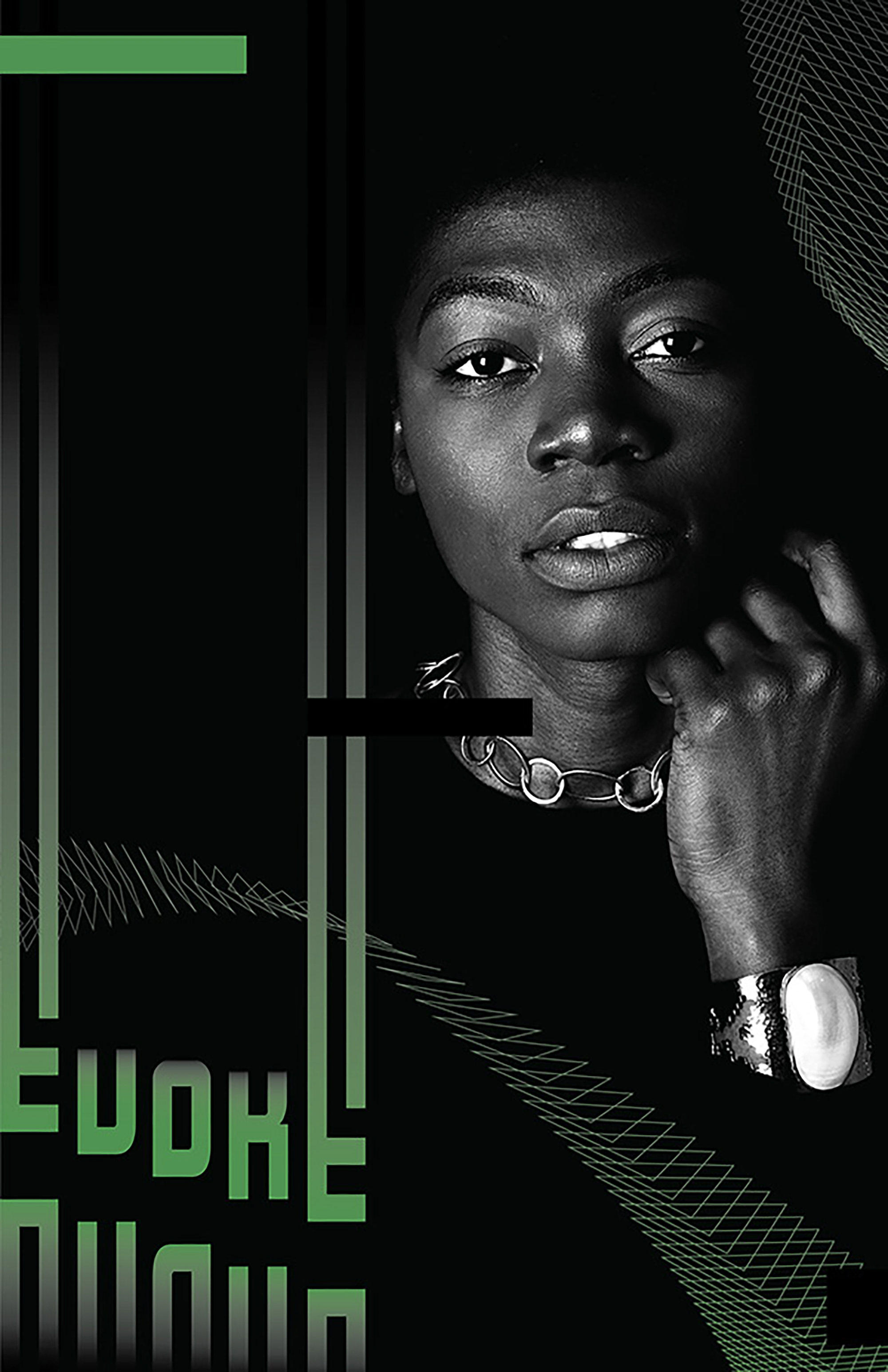
Sometimes a designer’s just gotta create.
Here are some experiments in graphic design (and not!) to keep the creativity and fun flowing.

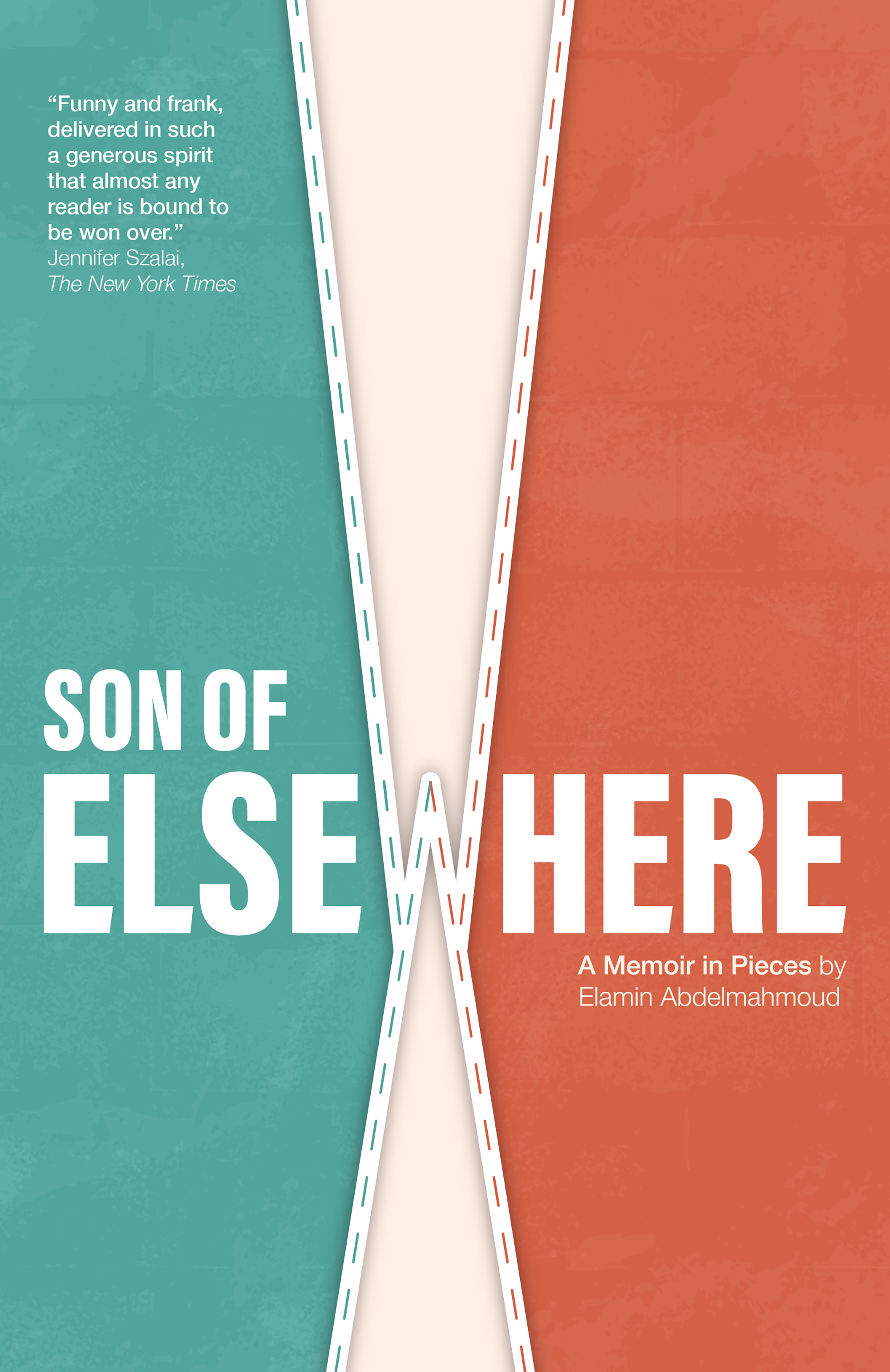
This was my entry for the 2025 Penguin Random House Canada Design Award. Following a set of provided guidelines, the challenge was to create a cover redesign for Son of Elsewhere by Elamin Abdelmahmoud.
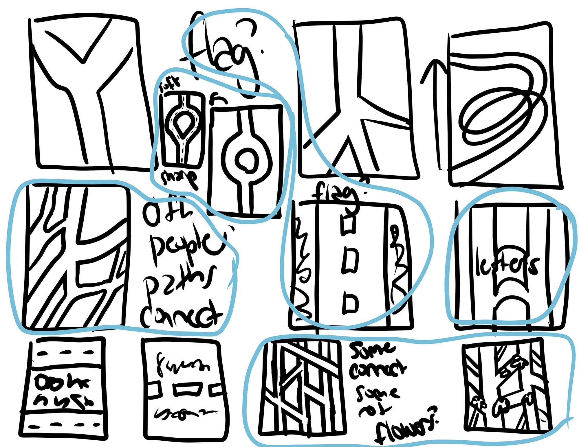
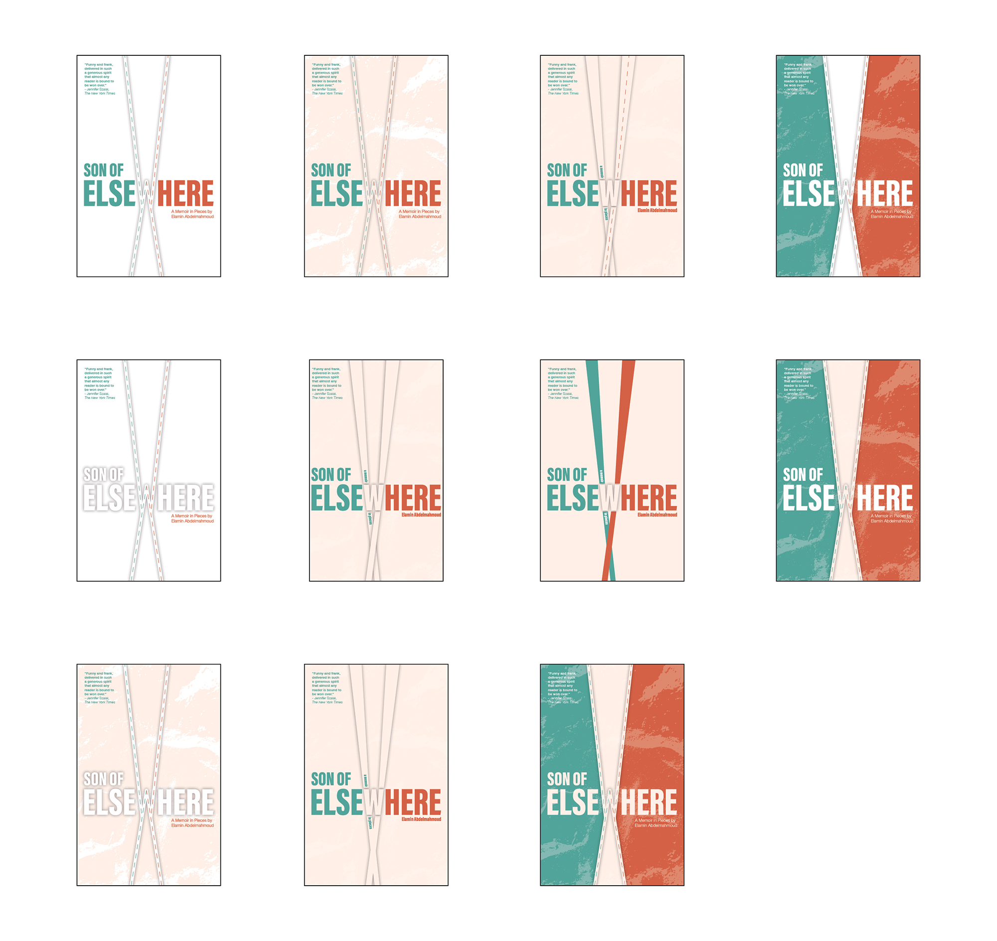
After sketching initial concepts based on the brief, I conducted research to better understand the book’s themes and cultural context. I then explored my ideas through digital sketches. I experimented with themes of roads, converging and diverging paths, as well as representing and combining the Sudanese and Canadian flags. I initially planned to experiment with the shades of red found in both the Sudanese and Canadian flags, however, the colours felt too aggressive.
The following are some key aspects of the finalized design:
The gentle oranges and blues are inspired by natural tones found in Sudanese-Canadian art. These colours also reflect the binary and contrasting themes present in the book.
The letter ‘w’ visually splits the word ‘elsewhere’, emphasizing the word ‘here.’ This symbolizes the author’s dual identity—being both ‘here’ in Canada and from ‘elsewhere’ in Sudan. The ‘w’ also resembles a road, suggesting connection rather than separation between these two worlds and identities.
The design incorporates textures reminiscent of Sudanese-Canadian artistry, such as clay, pottery, and brickwork.
A soft white runs through the middle of the design, referencing the white found in both the Sudanese and Canadian flags. It stands for peace and celebrates holding multiple identities at once.
Although my submission was not selected as a finalist, the process of reaching my final design was rewarding.
Stock photography used for textures.