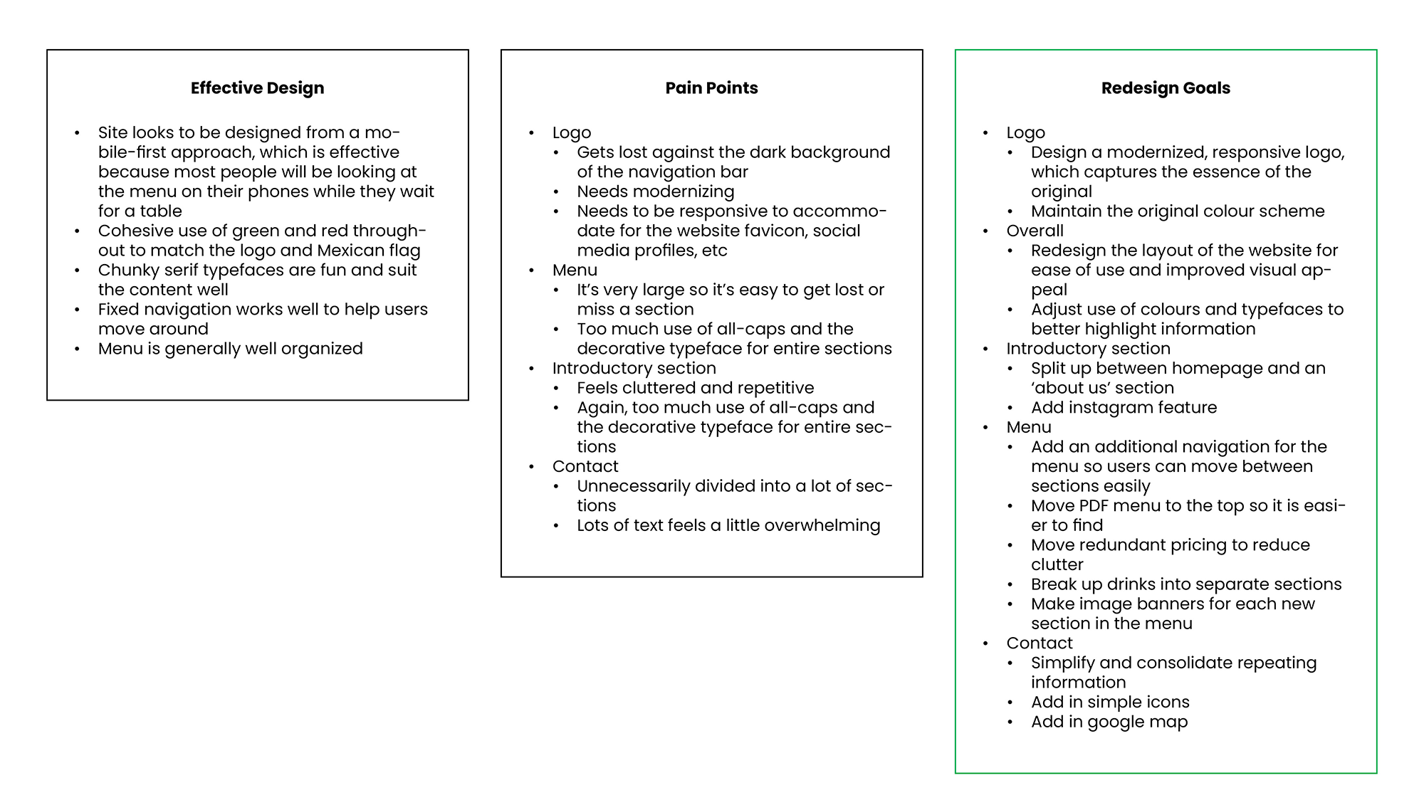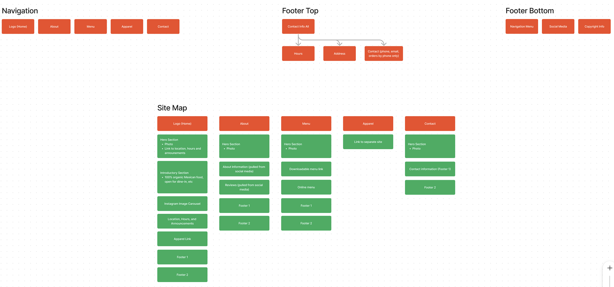
In this case study, I analyzed an existing website that I found to be cluttered and difficult to navigate.
Using a UX/UI design approach, I restructured and redesigned the site to achieve a cleaner, more modern user experience.

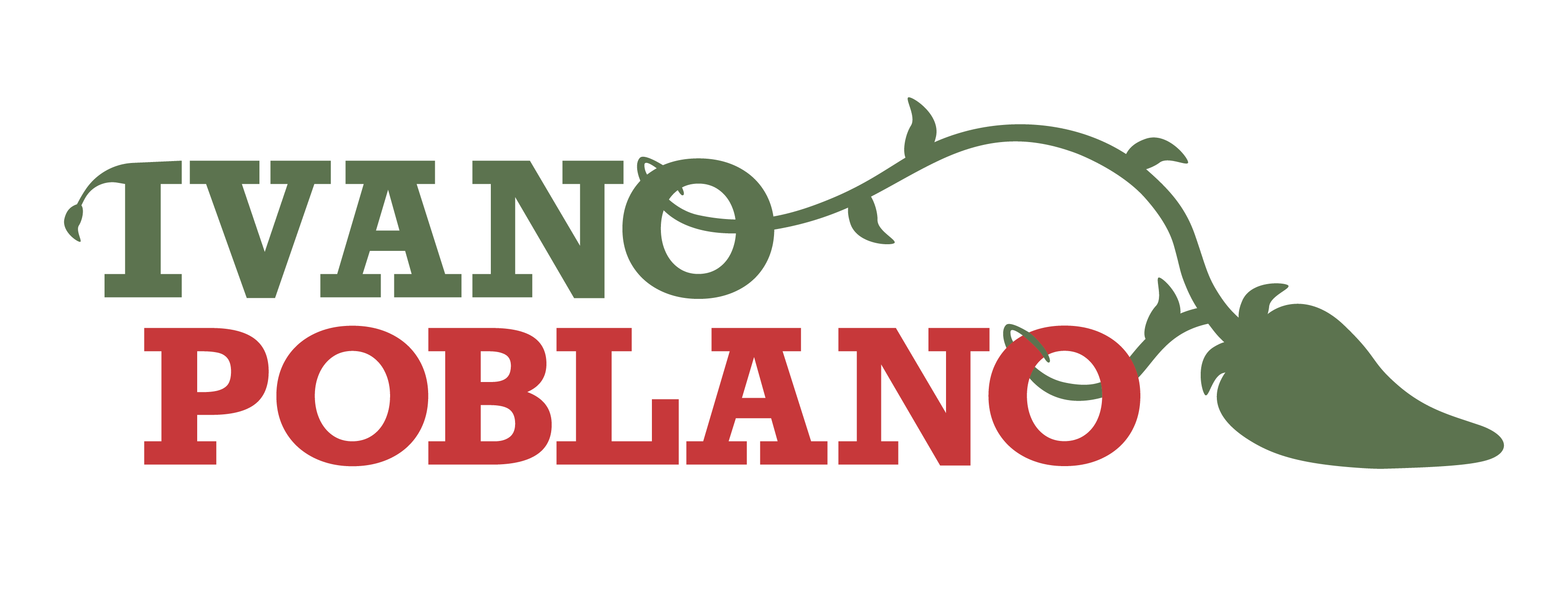
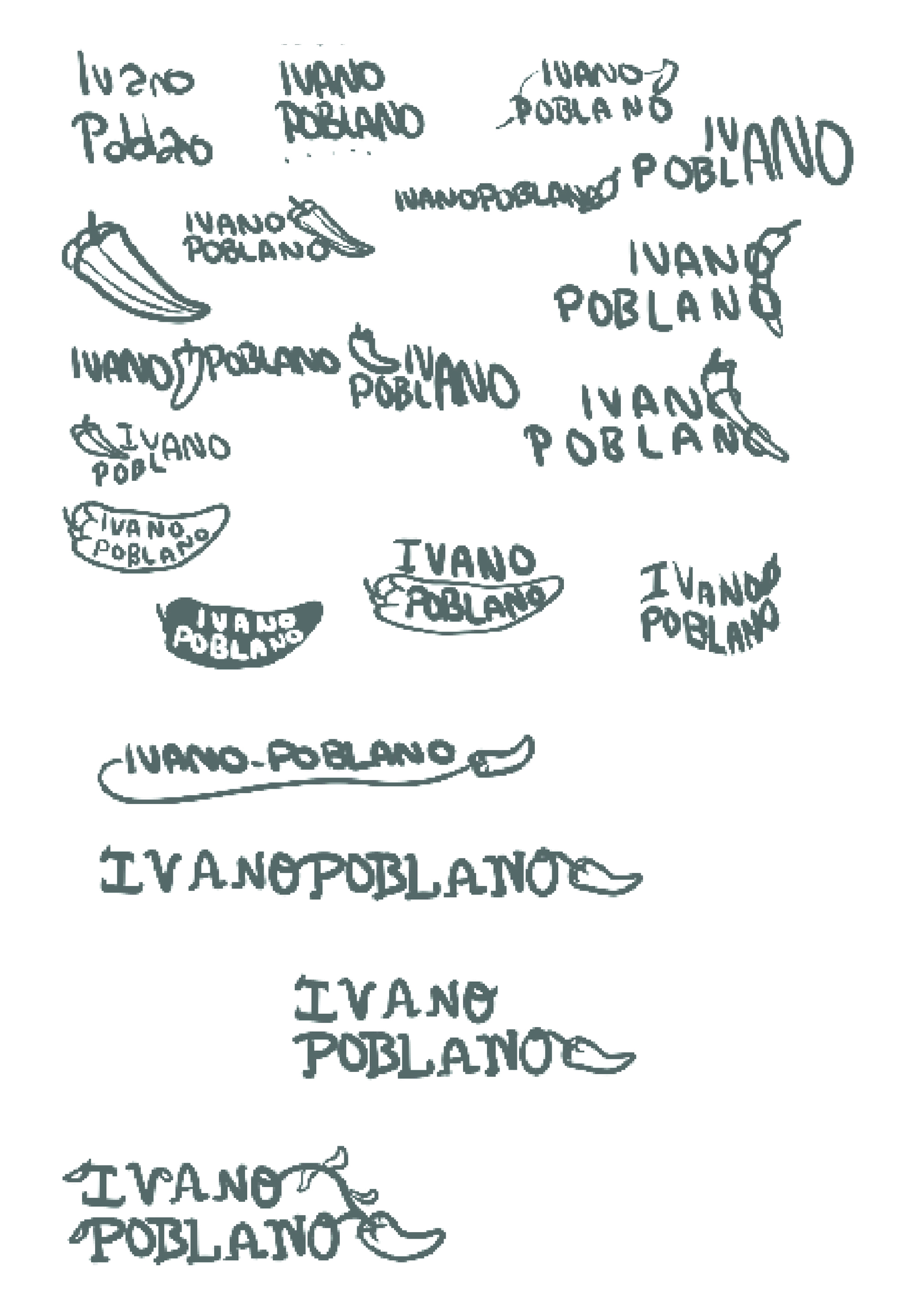
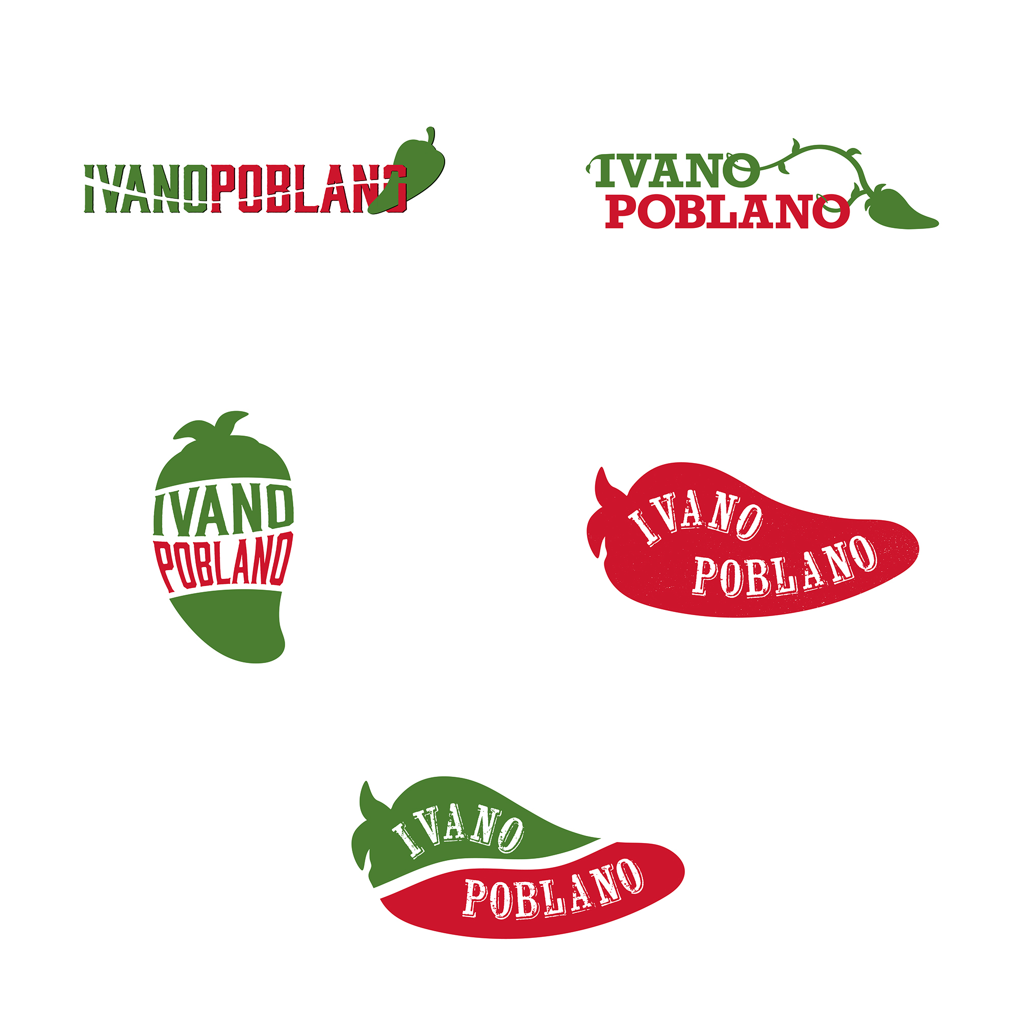
After iterating through rough sketches and digital drafts, I finalized a design that strikes a balance between the original style and a more modern, refreshed look. I was pleased to keep the original intertwining vine element, which helps maintain brand continuity. At this stage, I also created an icon version of the logo, optimized for use on social media profiles and as a favicon.
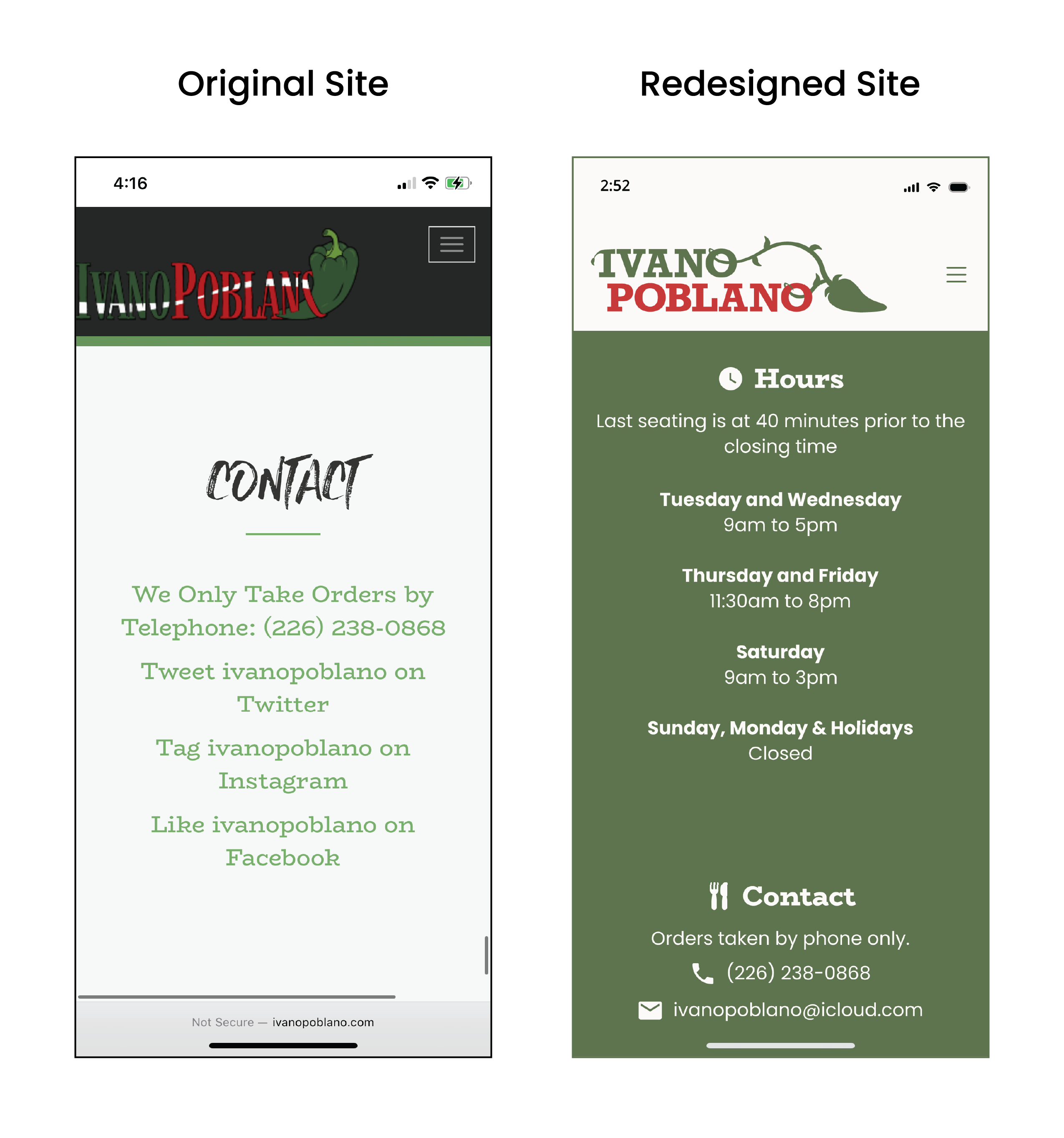
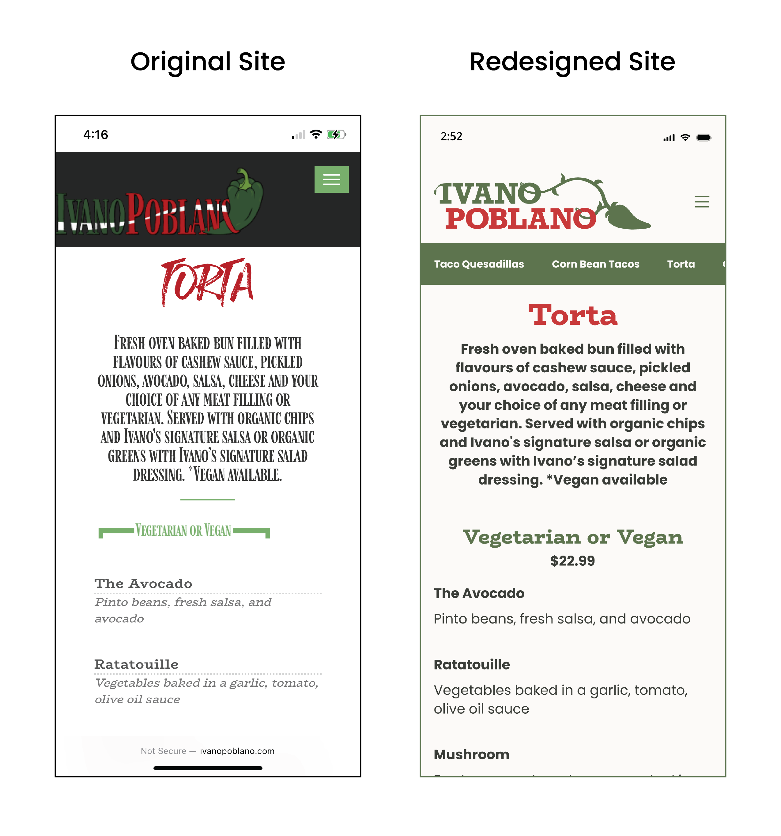
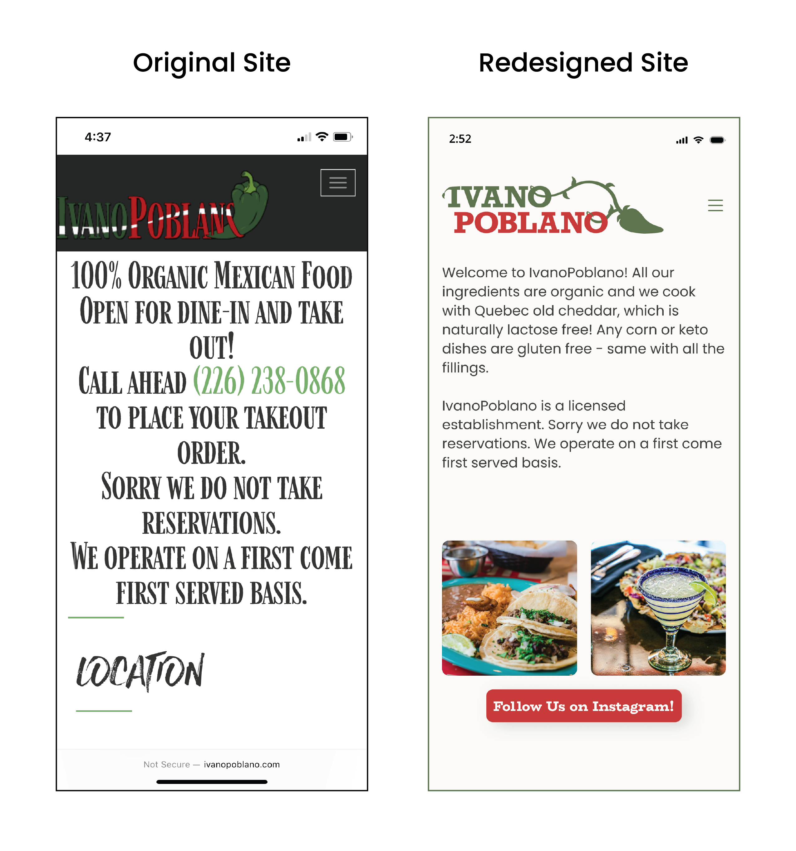
Once the site’s flow was finalized, I applied the updated branding by incorporating redesigned colors, typography, hierarchy, and imagery. My goal was to retain the original green and red colour palette but desaturate the tones slightly to create a softer look. I also simplified the typography, limiting it to two typefaces and using variations in weight and colour to create distinction where needed.