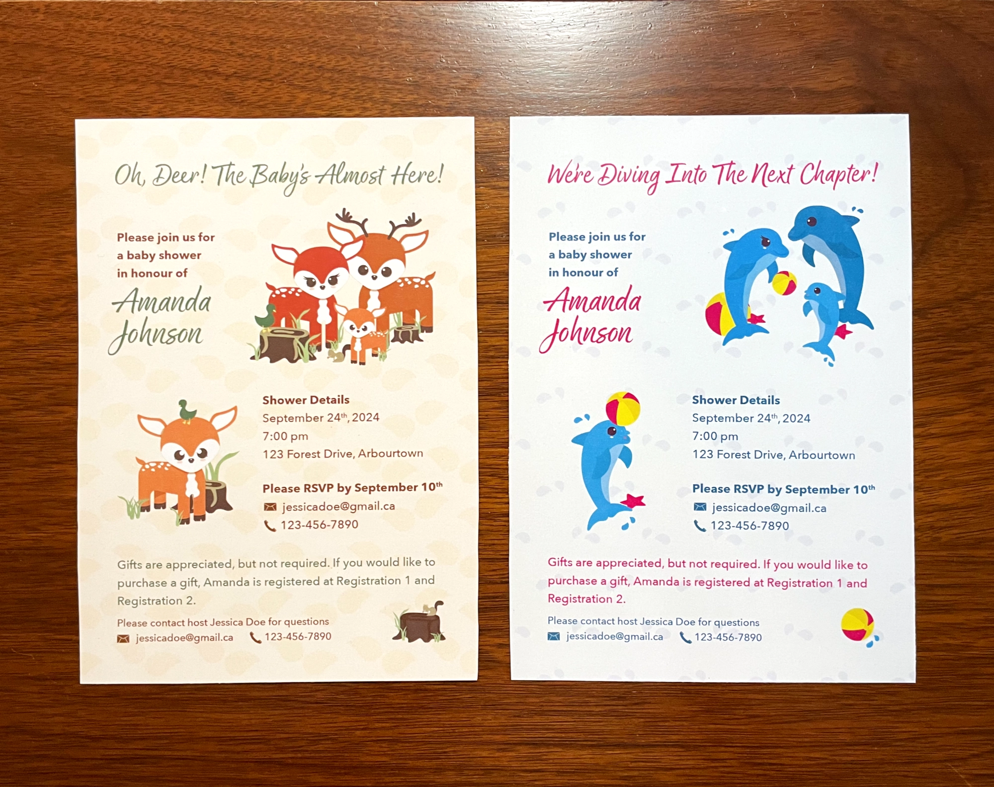

A series of projects with tight-turnarounds and freer creative control.
Case studies for branding and marketing, UX/UI design, and overall design.

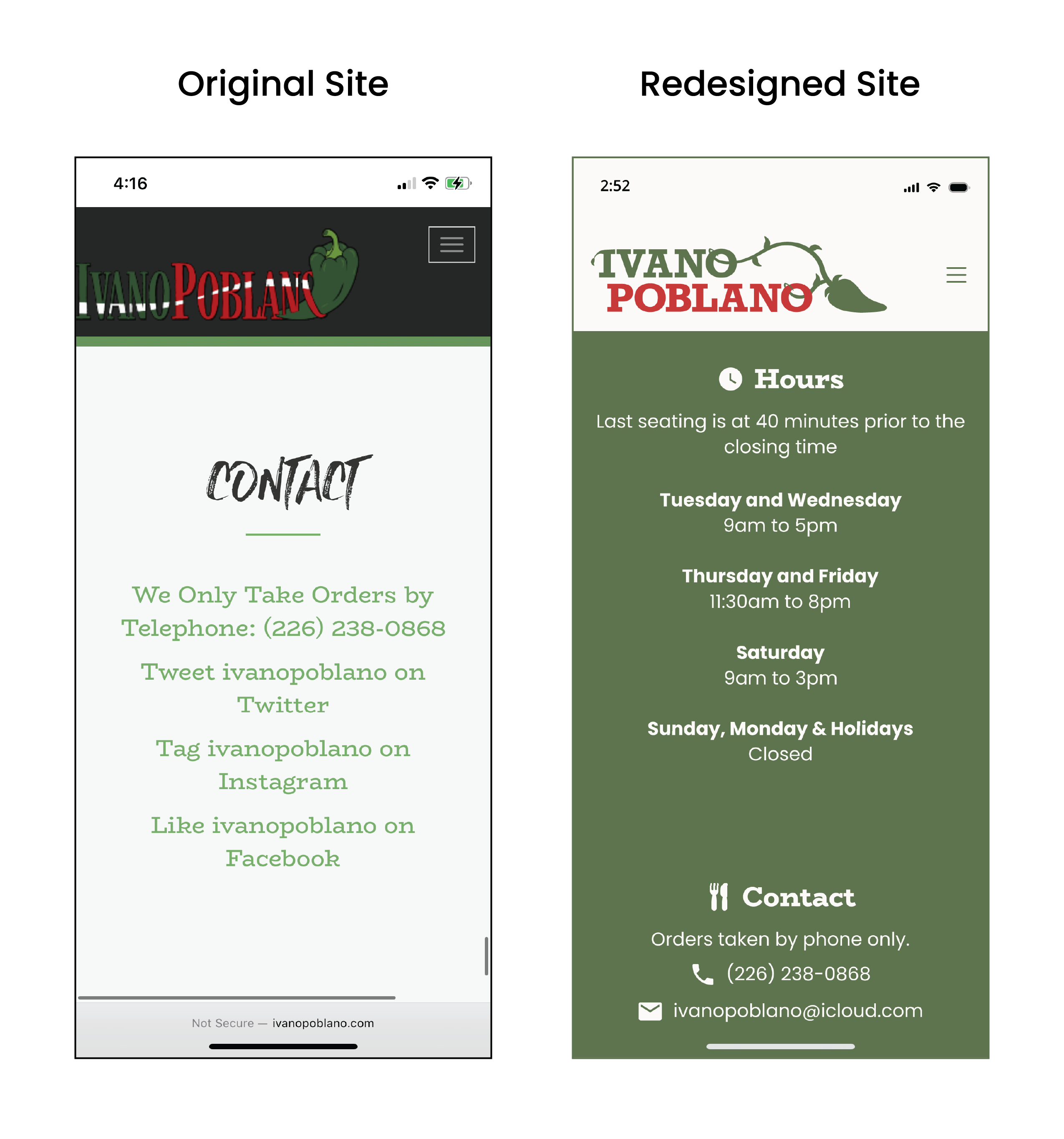
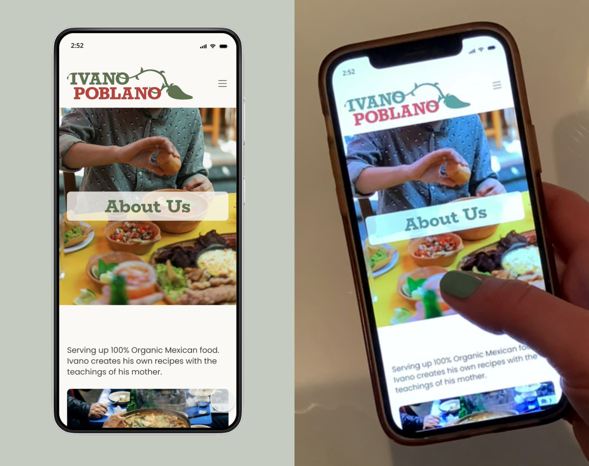
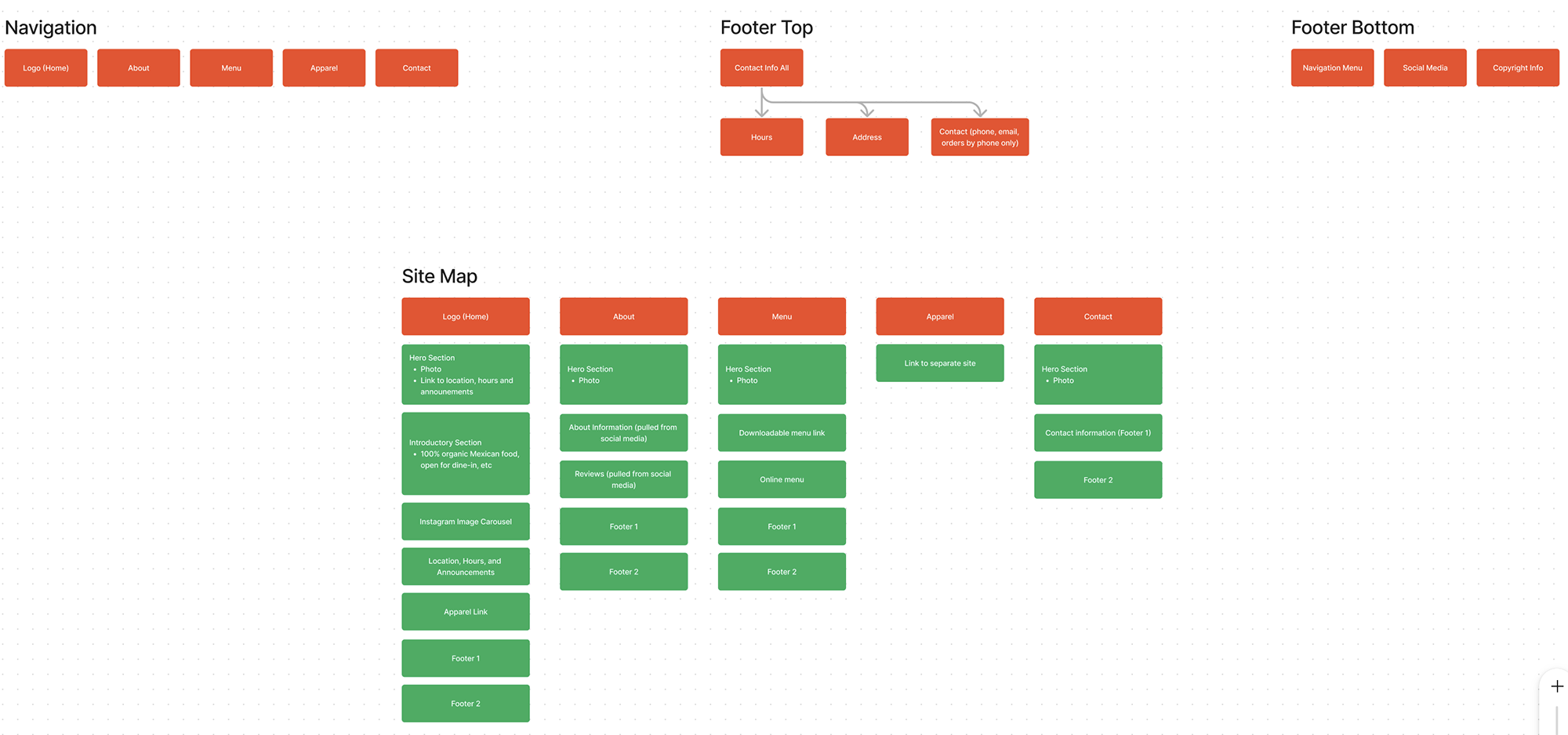
In this case study, I analyzed an existing website that I found to be cluttered and difficult to navigate. Using a UX/UI design approach, I restructured and redesigned the site to achieve a cleaner, more modern user experience.
For the design’s direction, my goal was to retain the original green and red colour palette but desaturate the tones slightly to create a softer look. I also simplified the typography, limiting it to two typefaces and using variations in weight and colour to create distinction where needed.
View the video below to see the prototype.
Designed using Figma and Adobe Illustrator. Content and images sourced from: original business website, original business social media page, Unsplash and Pexels.
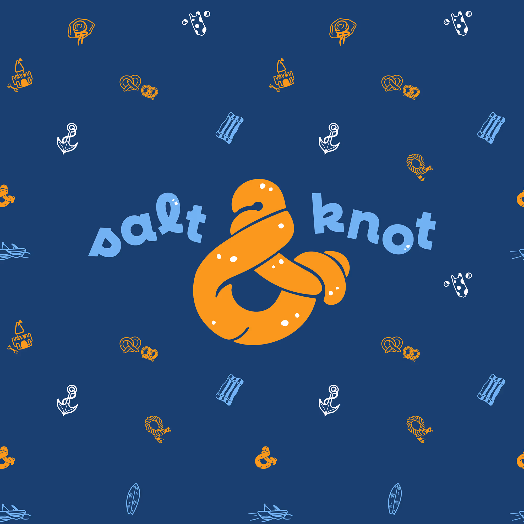

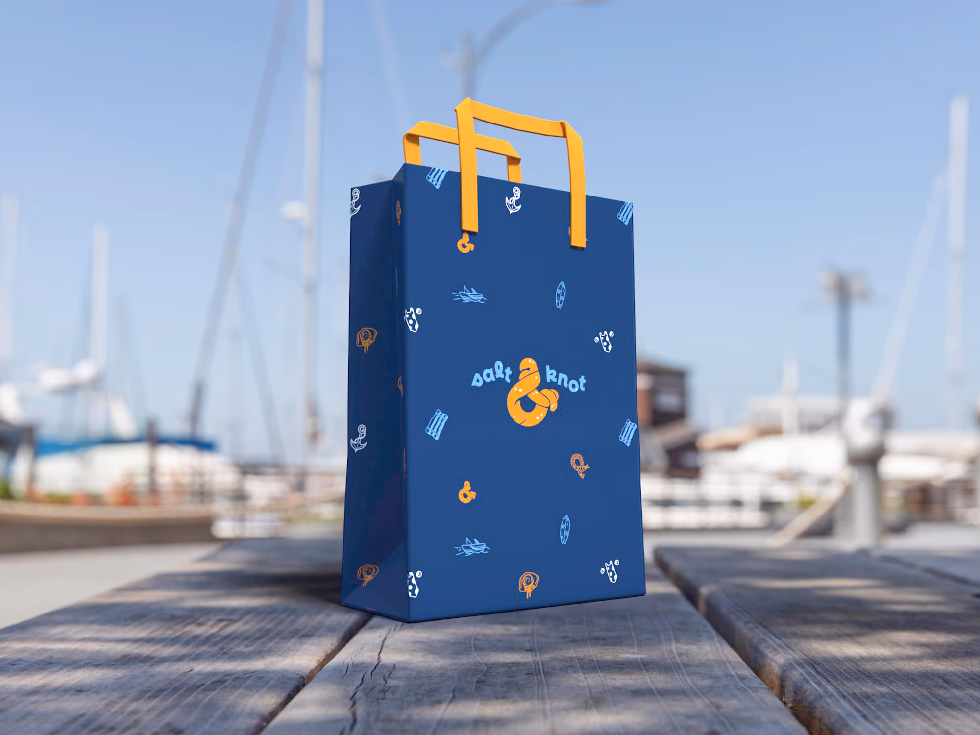
The Salt & Knot brief required a logo and takeaway bag design to be completed within a 7-day timeline.
The proposed logo and social media presence for the brand is beachy and playful, evoking carefree days in the sun with family and friends. Imagery of smiling faces and clear blue waters reinforces the lighthearted spirit the brand aims to represent.
I extended this association in the storyboard for the promotional video (see below), positioning Salt & Knot pretzels as the perfect companion for a relaxing beach day. The goal was to make bringing Salt & Knot to the beach feel like a no-brainer.
Designed using Adobe Illustrator and Adobe Photoshop. Brief provided by @briefclub on Instagram. Mockup templates provided by mockups-design.com. Stock photography and video clips.
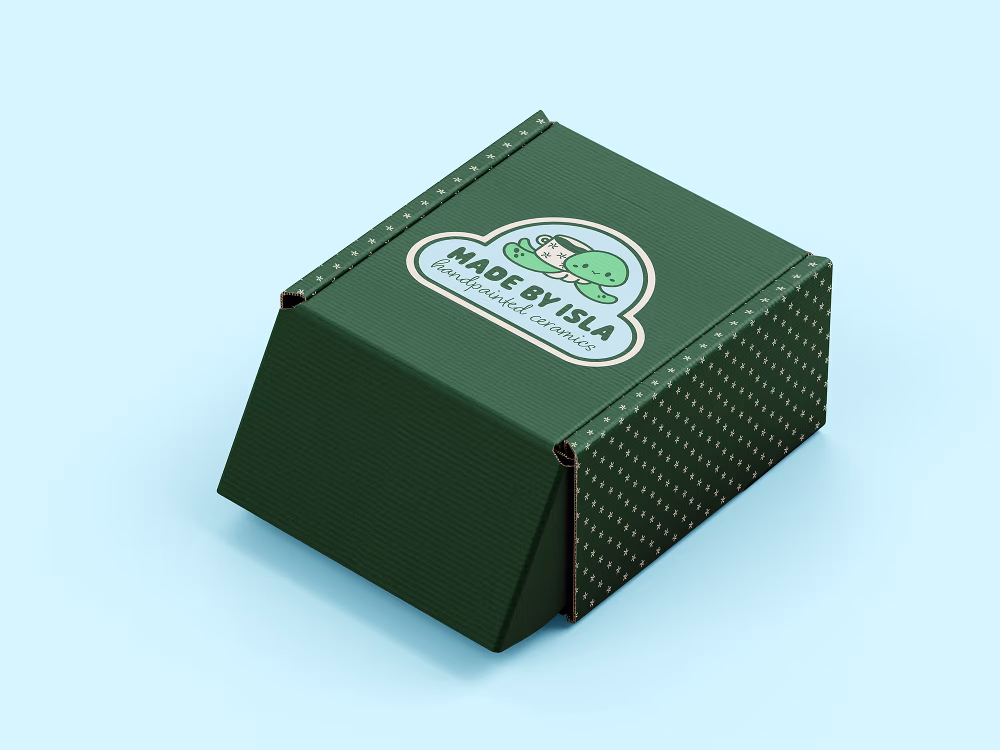
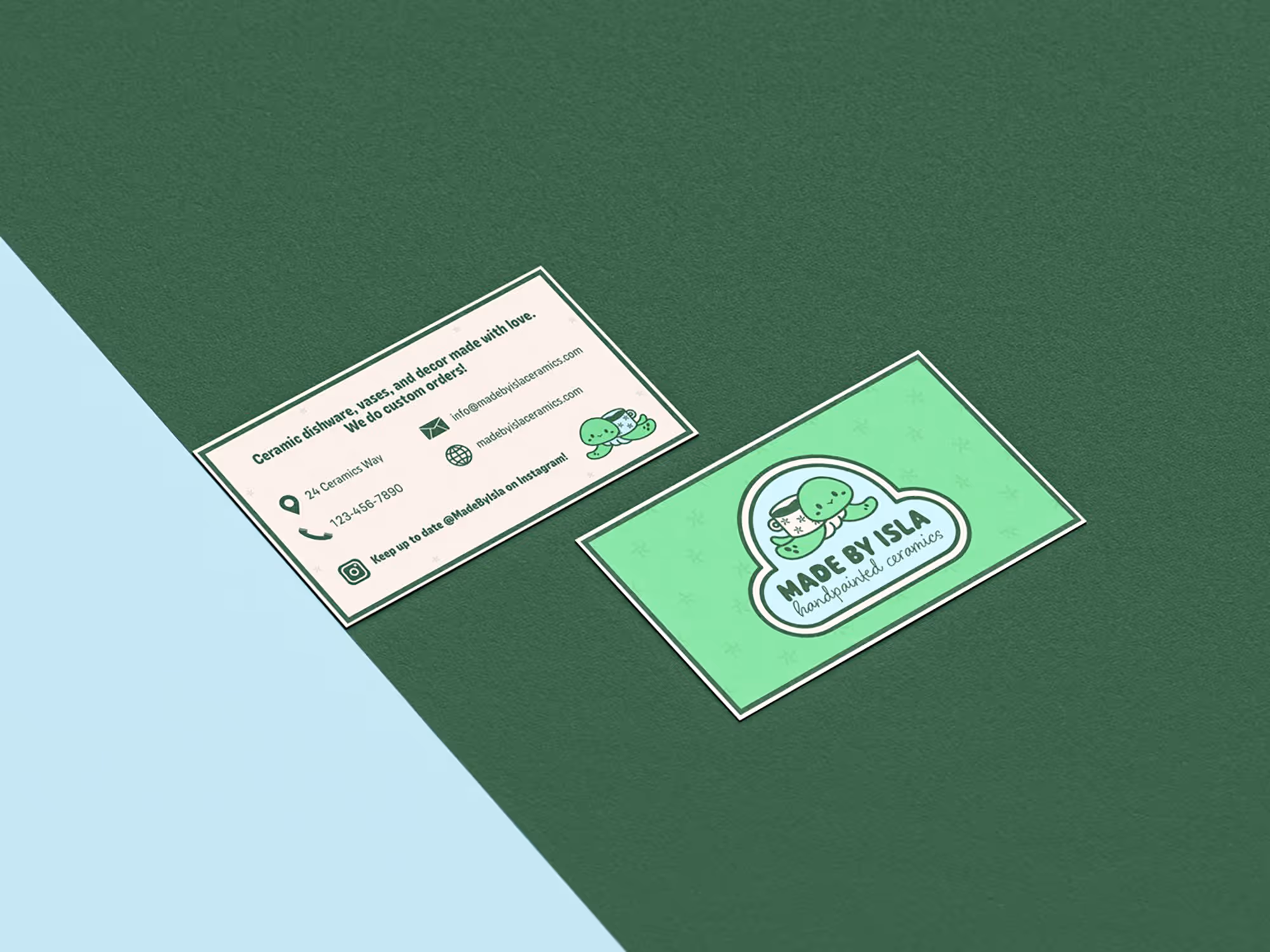
To complete a 7-day brief, I needed to develop both a logo and a business card design for the brand Made by Isla.
Rather than taking the predictable route of an ancient, stone-inspired aesthetic for this ceramics brand, I chose a more colourful and playful approach. The final design introduces Layla, a turtle with a ceramic mug for a shell, as the brand’s lovable mascot.
Designed using Adobe Illustrator, Adobe Photoshop and Adobe After Effects. Mockup templates provided by mockups-design.com. Brief provided by @briefclub on Instagram.
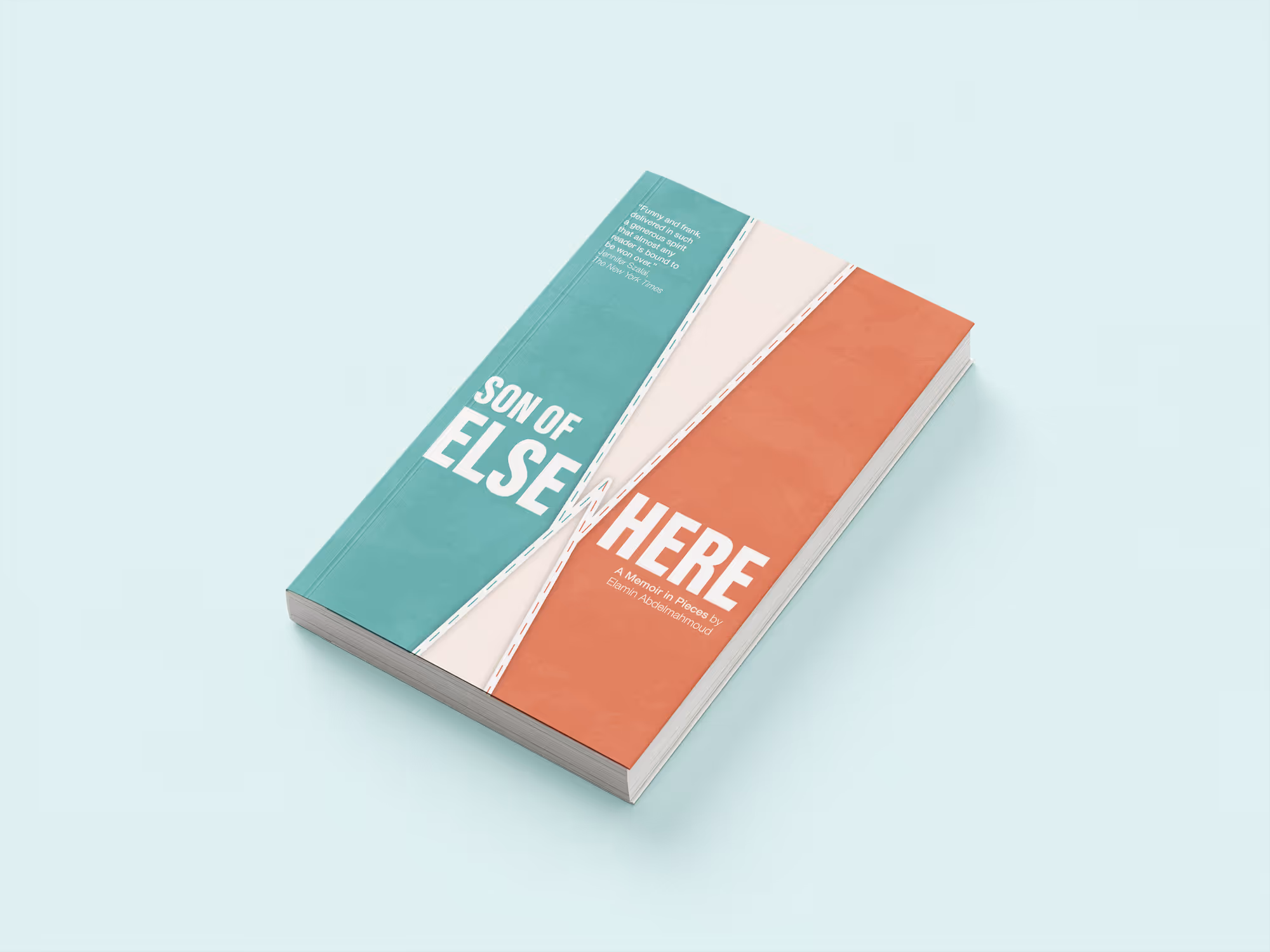
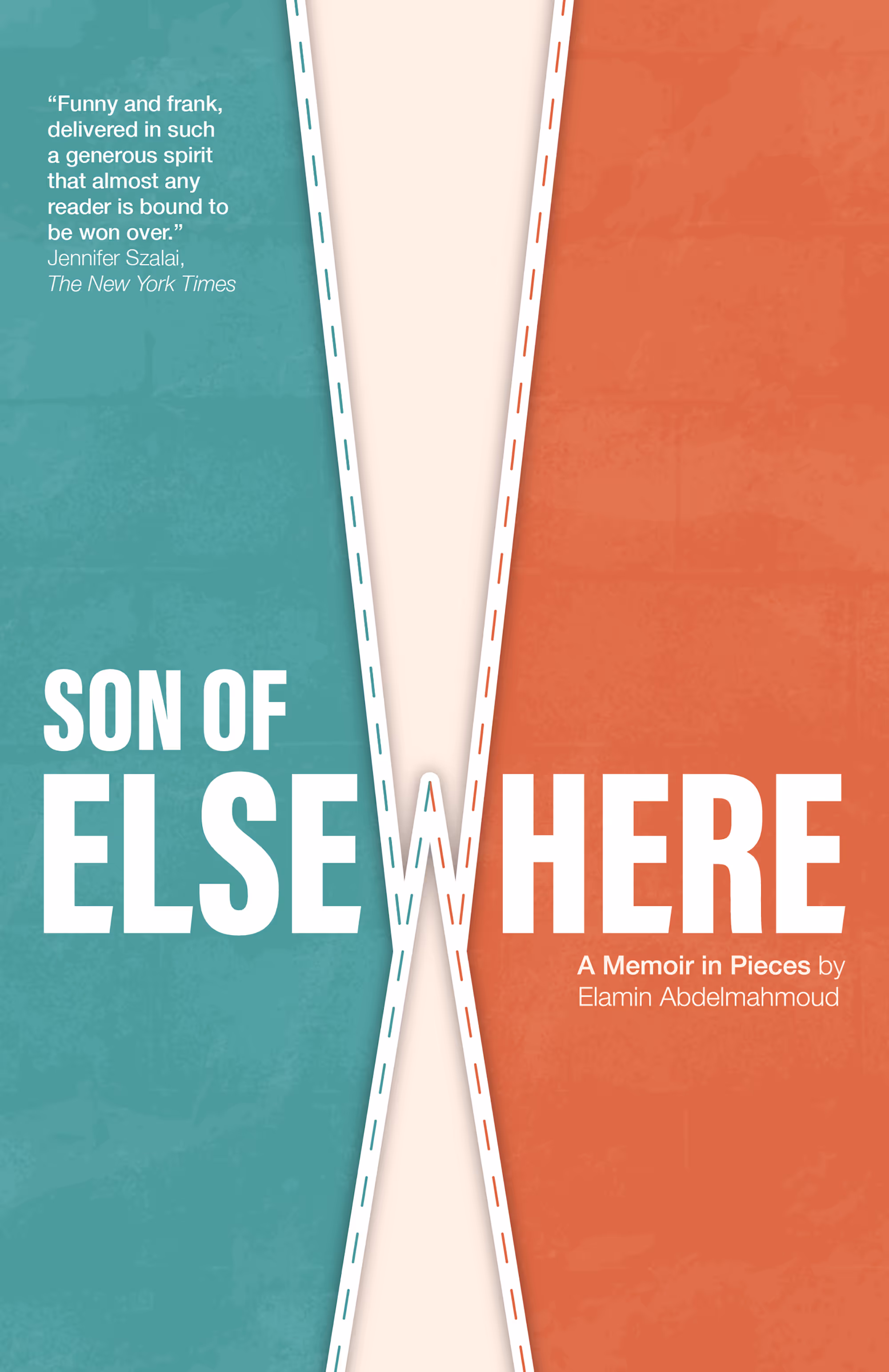
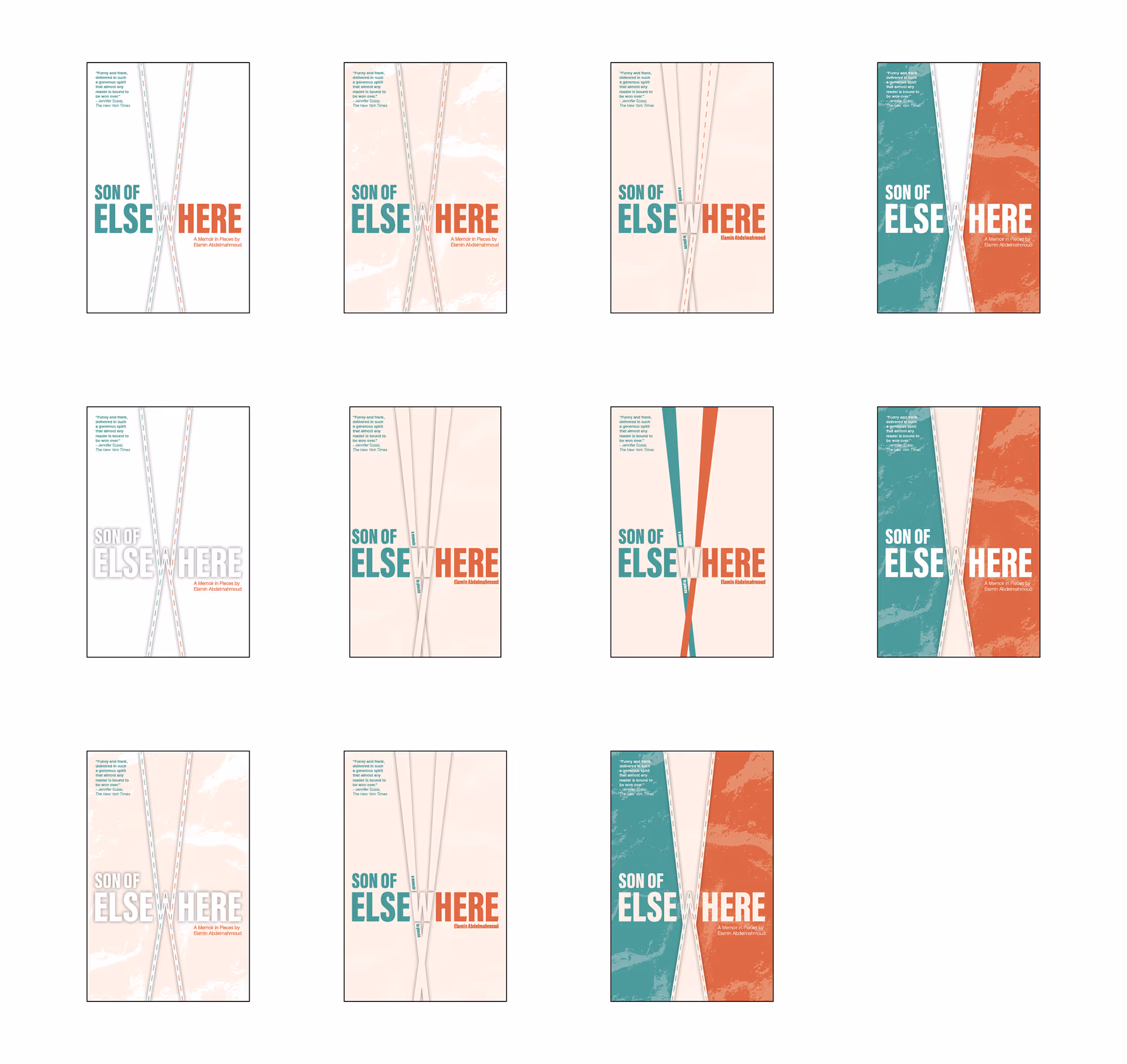
This was my entry for the 2025 Penguin Random House Canada Design Award. Following a set of provided guidelines, the challenge was to create a book cover redesign for Son of Elsewhere by Elamin Abdelmahmoud. Although my submission was not selected as a finalist, the process of reaching my final design was rewarding.
Designed using Adobe Illustrator. Stock photography used for textures. Mockup templates provided by mockups-design.com.